
Choosing the Best Forex Trading Platform in Pakistan
Looking for the best forex trading platform in Pakistan? Discover key features, security, costs, tools, and support to pick the right fit for you 📈💼
Edited By
Amelia Dawson
A forex trading logo is more than just a graphic. It forms the backbone of a broker's or trading platform’s identity, helping them stand out in Pakistan’s fiercely competitive market. With hundreds of brokers vying for attention, a well-crafted logo instantly tells traders about reliability, professionalism, and trustworthiness.
In forex trading, trust is everything. Traders often decide where to place their capital based on the perceived credibility of a platform, and logos play a subtle but powerful role in shaping that perception. A strong logo helps convey stability and security, qualities that most investors seek before committing their money.
When designing a forex trading logo, several elements come into play:
Colour choice: Blue often represents trust and stability, while green suggests growth and profitability. Choosing Pakistan's national colours subtly can also evoke a sense of local pride.
Symbolism: Arrows, graphs, or abstract financial icons indicate movement and opportunity. Avoid overly complicated designs that confuse the viewer.
Typography: Clear and bold fonts project confidence and professionalism. Simple lettering makes the name memorable and easy to recognise.
Consider a local broker that uses a sleek blue and silver logo with a rising graph icon. This combination communicates upward progress and dependable service. On the other hand, overuse of flashy colours or cluttered icons can make a platform look unreliable or amateurish.
A logo that balances simplicity with meaningful financial symbols helps build a trustworthy brand image among traders in Pakistan and beyond.
Practical tips for designing effective logos include:
Keep it scalable – it should look good on mobile screens and billboards alike.
Ensure it works well in monochrome for printing on documents.
Get feedback from actual traders before finalising.
By focusing on these design principles, forex brokers can gain an edge in attracting and retaining clients in Pakistan’s fast-evolving forex landscape.
A logo serves as the visual bedrock of a forex trading brand. It does more than decorate a website or an app; it shapes how traders recognise and relate to a broker or platform. Given the competitive nature of forex trading—especially in Pakistan's bustling markets—a strong logo helps brokers embed their identity in the trader’s mind quickly and effectively.
Brand recognition hinges on consistent exposure to a distinct logo. For forex brokers, this means their logo becomes a shorthand for the company’s reputation and service quality. Take, for instance, a new trader scanning multiple platforms: a memorable logo can make the difference between clicking on one broker's site over another. In Pakistan where many brokers compete for the same slice of the market, having a logo that sticks out ensures a first step toward loyalty.
Forex trading involves handling money and personal data, so trust plays a central role. A professional, well-crafted logo signals seriousness and reliability. It’s the first proof point that a broker is committed to quality service. For example, a clean, stable design with familiar financial symbols can reassure traders that the broker meets industry standards, which is critical to attracting cautious investors.
With dozens of brokers and platforms vying for attention online, differentiation is essential. A logo helps set a brand apart by communicating its unique selling points subtly and quickly. In Pakistan, where local preferences might lean towards certain colour schemes or cultural symbols, tailoring the logo for this audience enhances visibility. A broker that cleverly blends modern design with local tastes will attract more eyeballs and clicks.
A logo embodies a company’s commitment to professionalism. Brokers with polished, no-nonsense logos project an image of careful management and reliability. This reassures traders that the platform won’t disappear suddenly or mishandle funds. Think about logos using simple, strong fonts and stable geometric shapes – these imply steadiness and trustworthiness.
Design elements like clear lines and trust-related symbols (locks, shields) in a logo suggest transparency and a secure trading environment. In forex, where scams still lurk, logos that visually convey safety give brokers an edge. Transparent design translates to an impression of open communication and straightforwardness, key values for a Pakistani trader concerned about fraud.
Logos also tell a story about how forward-thinking a company is. Including tech-inspired graphic elements (like digital grids or sleek, angular icons) signals that a broker embraces fintech innovation. This is especially relevant for younger Pakistani traders who expect smooth mobile trading and fast execution. A modern logo can communicate agility and cutting-edge services without saying a word.
A thoughtfully designed forex trading logo isn't just about aesthetics—it acts as a silent ambassador for your brand, shaping trader perceptions and building the foundation for long-term relationships.
In summary, the role of a logo in forex trading branding goes well beyond appearance; it’s a powerful tool for recognition, trust-building, and expressing a broker’s core values. Brokers that invest in their logo’s design effectively position themselves to attract and retain traders in Pakistan’s competitive market landscape.
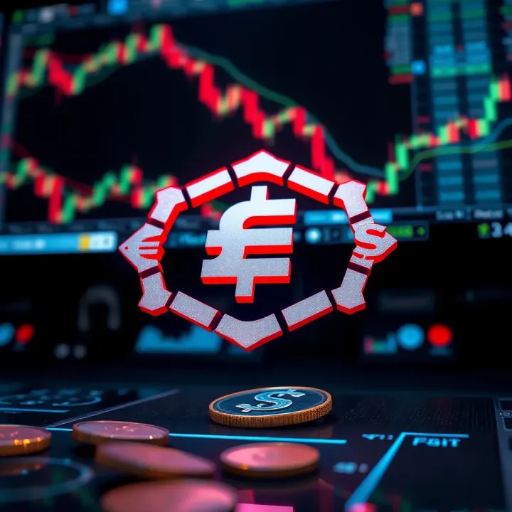
A strong forex trading logo should encapsulate distinct visual elements to communicate the broker’s values and nurture trader confidence. The logo acts as the brand’s first handshake, so its core components—colour, typography, symbolism, and format—must work in harmony to make a memorable and trustworthy impression.
Common colours in financial logos usually include blues, greens, and greys. For example, many established forex brokers use shades of blue because it conveys professionalism and calm, while green often represents growth and prosperity. Grey adds a touch of neutrality and balance. Pakistani forex platforms adopting these hues tend to come across as reliable and mature in the eyes of their audience.
Colour psychology and trader perception play a vital role. Blue tones make traders feel secure and confident, key when money is involved, whereas red, often used sparingly, can indicate urgency or market action but risks creating anxiety if overused. Yellow or orange can add optimism but might reduce seriousness. These perceptions directly affect how traders view the brand before even checking its services.
Using colours to convey stability and trust means selecting shades that communicate steadiness rather than volatility. A deep navy blue paired with muted green, for instance, projects a stable yet growth-oriented image. This combination appeals particularly well in Pakistan, where financial decisions are often cautious due to economic uncertainty. A logo’s colour palette should therefore aim to assure traders that their investments are in safe hands.
Fonts that communicate professionalism are typically clean sans-serifs or well-crafted serif fonts. Avoid overly fancy or quirky fonts that might distract or seem untrustworthy. A font like Helvetica or Lato, balanced with crisp spacing, signals clarity and seriousness, helping forex brokers come across as dependable and straightforward.
Symbols associated with currency and trading often draw from familiar motifs such as arrows going upward, candlestick charts, or currency signs like $, £, €, and Rs. Including a subtle upward arrow or a stylised graph in the logo hints at growth and success. For Pakistan-specific branding, integrating the Rs symbol in a minimalist way can strengthen local trader connection.
Balancing simplicity and distinctiveness is key. The logo must be straightforward enough to recognise at a glance but distinct enough to avoid blending in with competitors. A good example is a simple geometric shape combined with a unique twist—say, an abstract phoenix representing rebirth and resilience, often admired symbols in financial circles.
Adapting logos for digital platforms and mobile apps is crucial because traders mostly access platforms on smartphones or tablets. Logos must maintain visibility and clarity even on small app icons or browser tabs. Overly detailed logos may lose impact when scaled down.
Maintaining clarity at various sizes requires avoiding tiny text or intricate details that blur. Bold shapes and well-spaced elements work better. A Pakistani forex app logo that looks sharp on both a 50-pixel mobile icon and a large desktop screen strengthens its brand recall consistently.
Vector formats for flexible use ensure that the logo can resize without losing quality, whether printed on banners, business cards, or displayed online. Using vector graphics like SVG or AI files allows forex brokers to maintain a crisp image, crucial for professional presentations and marketing collateral.
A thoughtfully crafted forex trading logo is more than an image; it is a tool that builds trust and signals professionalism to traders from Pakistan and beyond.
Creating a forex trading logo requires a clear strategy that blends market insight, design expertise, and cultural fit. This helps brokers or trading platforms project the right image while standing out in Pakistan’s competitive financial sector. Understanding design strategies ensures the logo not only looks good but also connects with traders effectively.
Analysing popular forex broker logos involves a detailed look at leading industry players to see what kind of visual styles, colours, and symbols they prefer. For example, many international brokers use blue to signify trust, while others adopt green for growth. Observing these trends helps avoid imitation and inspires ideas that align with your brand’s focus.
Identifying gaps and opportunities means spotting what others miss—maybe a style that local traders in Pakistan favour but remains underused internationally. If most logos look too complex, a clean and minimal design could stand out. Recognising these gaps lets you carve a distinct place in a crowded market.
Aligning with Pakistani market preferences is critical since local traders respond to cultural and linguistic cues. For instance, certain colour tones or symbols may feel more inviting or trustworthy here. Using Urdu calligraphy styles or incorporating Pak rupee signs subtly can add familiarity, making the logo resonate better among local users.
Benefits of professional design agencies include access to skilled experts who understand brand strategy and market trends. Agencies bring polished techniques, ensuring logo scalability and usability across digital platforms. For example, a professional firm can offer multiple revisions and in-depth research to deliver a logo that stays sharp on both mobile apps and websites.
Advantages of DIY logo tools lie in affordability and speed. Platforms like Canva or Looka help startups or small brokers experiment without heavy investment. These tools provide ready-made templates inspired by financial themes, allowing early-stage ventures to create logos quickly while still maintaining a decent quality, though they may lack uniqueness.
Balancing costs and quality means evaluating your budget against brand impact. A high-quality logo can be worth investing in for long-term branding, but for traders starting out or testing markets, DIY tools offer practical value. Often, a hybrid approach works: start with DIY concepts, then hire a designer to refine the best ideas.
Gathering opinions from target audience involves showing drafts to traders, investors, and analysts who will interact with your brand. Their feedback can uncover unintentional meanings or weaknesses in design. For instance, if users find the logo confusing or unprofessional, it signals a need for revision.
Adjusting based on usability and appeal means ensuring the logo looks good and functions well in real use. It should maintain clarity on small screens and in print, and colours must print true on business cards or digital ads. Iterating based on such practical tests prevents costly rebranding down the line.
Ensuring cultural appropriateness is vital for an Islamic country like Pakistan. Avoid symbols that inadvertently cause offence or are culturally insensitive. Testing for appropriateness also helps the logo fit within local sensibilities, supporting stronger brand acceptance and reducing risks of negative perception.
A thoughtfully researched and tested logo is more than an image; it becomes a trust signal and a key competitive edge for forex platforms in Pakistan’s evolving financial markets.
Employing these design strategies will aid you in creating a forex trading logo that not only looks professional but also truly connects with your target audience.
First impressions in online trading are everything. When traders land on a forex broker's website or app, the logo is often the first visual cue they notice. A polished, well-crafted logo conveys seriousness and professionalism, signalling that the broker is reliable and knowledgeable. For example, well-known platforms like FXTM and IG Markets use simple, clean logos that instantly communicate authority without overwhelming the viewer. This matters especially in Pakistan where traders tend to be cautious, preferring platforms that feel credible from the first glance.
Perceived security through design elements goes beyond aesthetics. Elements like strong, bold fonts and stable geometric shapes (squares, circles) can give an unconscious sense of safety and trust. Colours such as dark blue or green often reflect stability and growth, while metallic shades hint at sophistication. A forex broker using these design choices can help ease traders' doubts about the legitimacy of the platform. For instance, brokers incorporating padlock symbols subtly into their logos or app icons often suggest enhanced security, reassuring users about data protection and regulated trading.
Consistent branding across platforms plays a big role in building trader confidence. When a logo appears uniformly on a broker's website, app, social media, and email communications, it strengthens recognition and trust. This consistency tells traders that the brand is professional and well organised. Consider how JazzCash maintains the same logo design across its mobile app, website, and promotional materials, ensuring instant recall. Forex brokers who do the same reduce confusion and build a cohesive identity, which supports long-term engagement.
Recognition leading to customer retention happens because familiar logos create comfort. Once traders associate a logo with positive experiences, they are more likely to return. A memorable forex logo acts like a badge of trust; seeing it repeatedly encourages loyalty. For Pakistani traders, who balance many options and competitive commissions, this visual familiarity can tip the scales. Brokers with logos that stay consistent in look and feel tend to experience higher retention rates, as users develop a sense of reliability simply through repeated exposure.
A forex trading logo is not just a design; it’s a silent ambassador that builds confidence, assures security, and nurtures loyalty among traders.
In short, a professional, secure, and consistently presented forex logo helps brokers establish a trustworthy image. This encourages traders to engage more deeply and remain loyal over time, which is essential for success in Pakistan’s competitive forex market.
In the forex trading industry, logo design is evolving rapidly to keep pace with technological shifts and changes in consumer behaviour. Staying updated with current trends ensures brokers and platforms remain visually relevant and easily recognisable. These trends also help brands communicate professionalism, trust, and innovation—key factors that influence a trader’s confidence.
Simplicity for digital adaptation
Minimalistic designs remove unnecessary elements, focusing on clean lines and simple shapes. This approach helps logos display clearly on digital platforms, such as mobile apps and websites, where screen space is limited. Traders often view forex platforms on smartphones or tablets, so a logo that retains clarity without crowding the view plays a huge role in building immediate recognition and trust.
Simple logos also load faster and look sharp even at smaller sizes—a practical advantage for forex apps that want to keep interfaces swift and user-friendly. For example, FXTM uses a straightforward, flat logo with bold typography that works well across devices and print media alike.
Examples from leading forex platforms
Several top forex platforms have embraced this trend. IG Group and Saxo Bank, for instance, use flat logos with minimal colour palettes that project reliability without overwhelming the eye. Their logos avoid complex gradients and shadows, which could blur on smaller social media icons or browser tabs.
These examples show how minimalism is not just a design choice but a necessity to meet digital demands. Pakistani brokers entering the online forex space can learn from these by adopting simple, versatile logos that perform equally well on desktops, mobiles, and even printed materials.
Using modern shapes and gradients
Incorporating geometric shapes and subtle gradients adds a contemporary edge to forex logos. These elements suggest movement, growth, and connectivity—qualities prized in trading and finance tech.
For instance, some newer forex brokers use overlapping triangles or hexagons with gradient colours to imply forward momentum and layered market insight. These designs help differentiate brands in a competitive market, subtly signalling that the company keeps up with fintech advancements.
Reflecting fintech advances
Forex logos today increasingly reflect fintech innovations like artificial intelligence, blockchain, and algorithm-driven trading. Designers incorporate circuit-like patterns, pixel-inspired motifs, or dynamic lines to evoke speed and precision.
A case in point is eToro’s logo, which uses a smooth, modern font complemented by a simple icon reflecting social trading networks. Pakistani platforms aiming to attract tech-savvy traders might consider such digital-inspired visuals to highlight advanced tools and transparency.
Aligning your forex logo with current trends ensures your brand stays memorable, professional, and appealing, especially in Pakistan’s growing digital market. Keeping logos simple yet modern enhances both trader confidence and brand loyalty over time.
Minimalistic logos improve visibility on digital devices and maintain clarity at small sizes.
Modern shapes and gradients infuse logos with a fintech feel, aligning with innovation.
Examples from leading platforms offer a practical blueprint for emerging brokers.
Staying ahead in logo design can strongly influence a forex brand’s market presence and trustworthiness among Pakistani traders.
Looking for the best forex trading platform in Pakistan? Discover key features, security, costs, tools, and support to pick the right fit for you 📈💼
Find the best forex trading platform in Pakistan 🇵🇰 with our clear guide! Compare brokers, explore key features, and trade confidently today 📈💼
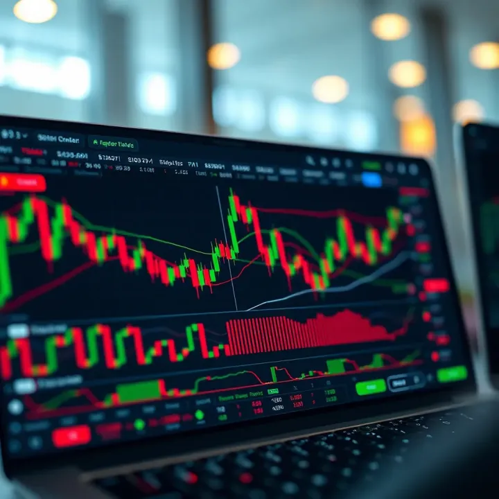
Looking for the best forex trading app in Pakistan? Discover top choices, security tips, and how to trade safely for a reliable experience 📈🇵🇰

📱 Discover the best forex trading apps in Pakistan! Learn key features, compare top platforms, and understand security & regulations for confident trading. 🇵🇰
Based on 13 reviews