
Understanding Reversal Candlestick Patterns in Trading
📉📈 Learn how reversal candlestick patterns like hammer and shooting star signal market direction shifts. Understand bullish and bearish signals to trade smarter and confirm moves.
Edited By
Charlotte Bennett
Candlestick charts are a popular tool among traders and investors for tracking price movements of stocks, commodities, currencies, and cryptocurrencies. Unlike simple line charts, candlesticks display four key data points: opening price, closing price, highest price, and lowest price within a specific time frame. This makes them especially useful for understanding market sentiment in real time.
A single candlestick consists of a body and wicks (also called shadows). The body represents the price range between open and close, while the wicks show the extremes during the period. When the close is higher than the open, the candle is bullish and often coloured green or white. If the close is lower than the open, it forms a bearish candle, typically red or black.
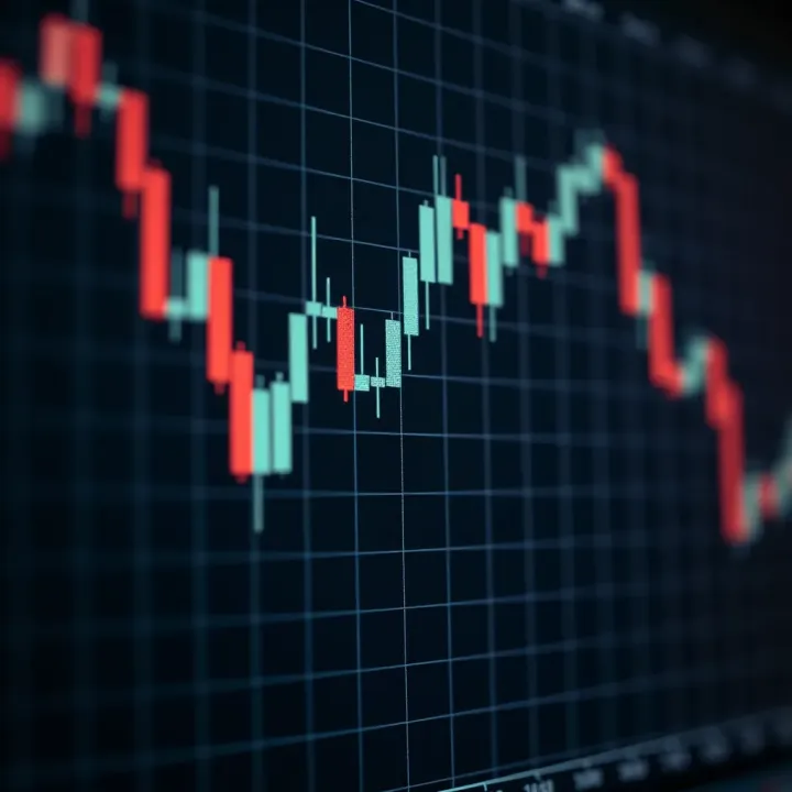
Recognising patterns formed by one or multiple candlesticks can help traders predict potential price directions. For example, a "hammer" pattern often signals a possible reversal after a downtrend, while a "shooting star" may warn of a bearish turn after an uptrend. These patterns reflect the tug-of-war between buyers and sellers, providing clues about upcoming moves.
Relying solely on candlestick patterns can be risky. It is best to combine them with other indicators like volume, support and resistance levels, and overall market trends before making trading decisions.
Here are key points to understand:
Candlestick charts provide richer information than simple price lines, making them ideal for short-term analysis.
Individual candlesticks convey immediate buying or selling pressure.
Patterns involving multiple candles reveal shifts in market sentiment.
Traders should verify signals with other data to avoid false alarms.
In Pakistan’s trading landscape, where volatility can spike around political events or economic news, mastering candlestick patterns is a valuable skill. Whether you trade equities on the Pakistan Stock Exchange or cryptocurrencies through local platforms, understanding these charts will help you respond more confidently to market changes.
Candlestick charts provide a clear visualisation of price movements in financial markets, helping traders quickly grasp market sentiment. Unlike simple line charts, they showcase opening, closing, high, and low prices in a compact format. This makes them invaluable for traders looking to spot potential reversals or trend continuations at a glance.
By understanding candlestick charts, you can anticipate market behaviour more effectively. For example, spotting a sharp rejection at a high price through a long upper wick can warn of a possible bearish turn. Such insights are vital for timely entry and exit decisions.
A candlestick consists of a body and thin lines called wicks or shadows above and below it. The body represents the price range between the opening and closing of the chosen time period—whether it’s one minute, one hour, or one day. The wicks show the extremes: the highest and lowest prices reached within that period.
Understanding this structure helps you evaluate market pressure. A long body suggests strong momentum, whereas prominent wicks can signal indecision or rejection of price levels. For instance, a small body with long wicks often appears during market uncertainty.
The open price is where trading started in the period, and the close is where it ended. These two form the body of the candlestick. The high and low prices form the tips of the wicks. Together, they summarise all price action during the period.
Knowing these points helps you interpret volatility and trend strength. A narrow range between open and close with wide high and low indicates high volatility but indecision, while a wide body with short wicks points to a decisive move.
Colours communicate market bias quickly. Typically, a bullish candle (price moved up) is shown in green or white, while a bearish candle (price dropped) is red or black. This colour coding instantly tells you if buyers or sellers dominated during the period.
For example, in the Pakistan Stock Exchange (PSX), a series of green candlesticks might indicate strong buying interest, while a succession of red ones may warn of selling pressure. Many Pakistani traders rely on this visual cue amid fast-moving markets.
Candlestick charting began in 18th-century Japan, invented by Munehisa Homma for trading rice. He noticed that market psychology influenced prices, so he developed a method to capture that feeling visually. His approach went beyond raw price data, exposing patterns of fear and greed in the market.
This system allowed merchants to time their trades better by recognising sentiment shifts, something still relevant to today’s markets. The rice market example shows how powerful visual tools helped before modern computers and indicators existed.
Western traders adopted candlestick patterns in the late 20th century, combining them with technical analysis. Now, they are standard on platforms worldwide, including Pakistan’s brokerage software.

Their practical strength lies in revealing potential reversals and continuations early. Traders in Karachi or Lahore who combine candlestick reading with volume and support levels gain an edge. This historical evolution confirms candlesticks’ role as a practical, time-tested trading tool.
Candlestick charts are more than just colourful bars—they capture the tug-of-war between buyers and sellers, making them indispensable for smart trading decisions.
Bullish candlestick patterns give traders clear signs that a downtrend might be slowing or reversing, signalling potential buying opportunities. Recognising these patterns helps in identifying moments when market sentiment shifts from selling pressure to buying interest, which is vital for effective trading. Understanding these patterns reduces guesswork and allows traders to enter positions with better confidence.
The hammer stands out as a reliable sign that a price decline could be ending. It features a small body near the top of the candlestick, with a long lower wick indicating sellers pushed prices down during the session but buyers regained control by the close. This buying pressure after a sell-off often points to a potential trend reversal.
In practice, spotting a hammer after a clear downtrend and near support levels strengthens its validity. For example, if the KSE-100 index forms a hammer at a known support zone with slightly higher trading volume, it suggests bulls are stepping in. Traders often look for the next session to confirm by closing above the hammer’s body before taking long positions.
The inverted hammer looks similar but with the long wick above and the body at the bottom. This indicates initial buying attempts met with selling pressure, but overall buyers showed strength by preventing lower closes.
Its practical use is similar to the hammer but requires more caution. After a downtrend, an inverted hammer signals a possible reversal but usually needs confirmation from the next candle. For instance, if a stock listed on the PSX shows an inverted hammer near support and the following candle closes higher, it confirms a shift in momentum.
This pattern involves two candles where a small bearish candle is completely engulfed by a larger bullish candle. The bigger green candle shows strong buying dominance overtaking prior selling pressure.
In trading, the bullish engulfing pattern is a strong bullish reversal indicator, especially if it appears after a downtrend and near critical support areas. For example, a blue-chip stock reversing with a bullish engulfing pattern accompanied by rising volume makes a convincing case for entering a long trade.
The morning star pattern is a three-candle formation signalling a bullish reversal. It starts with a large bearish candle, followed by a small-bodied candle (could be bullish or bearish) indicating indecision, and finally a bullish candle closing well into the first candle’s body.
This pattern reflects a slowdown in selling momentum followed by buyers taking charge. On the PSX, spotting a morning star at a significant support level can prompt traders to open position with a stop loss below recent lows. Its multi-candle setup provides a clearer signal compared to single-candle patterns, reducing the risk of false alarms.
Recognising these bullish candlestick patterns helps traders spot likely market turnarounds early, allowing timely entries with relatively lower risk compared to guessing market direction.
To sum up, incorporating these patterns within your trading plan, alongside support zones and volume confirmation, improves the odds of success. Keep in mind that no pattern guarantees results; confirmation and risk management remain key.
Bearish candlestick patterns play a significant role for traders aiming to identify potential price drops or reversals after an uptrend. Recognising these patterns can help investors and analysts take timely decisions like selling positions, setting stop losses, or avoiding fresh buys. In Pakistani markets, where volatility can spike around macroeconomic announcements or geopolitical events, understanding bearish signals becomes especially useful.
A shooting star is a single candle with a small real body near the day’s low and a long upper shadow, showing that buyers pushed prices higher but sellers regained control by closing prices near the opening level. This pattern often appears after an uptrend and signals a potential bearish reversal. For example, if the KSE-100 Index rises steadily and then forms a shooting star, this signals that bulls could be losing strength, prompting traders to watch for down moves.
The hanging man looks similar to a hammer but appears after a price rise. It has a small body at the top and a long lower shadow, indicating the bears tried to push prices down but bulls managed to hold the session. Despite closing higher, the pattern suggests caution as sellers could gain momentum soon. In practical terms, a hanging man on a high-volume day in stocks like PSX-listed banks may warn of impending corrections or consolidation.
This pattern involves two candles: a smaller bullish candle followed by a larger bearish candle that completely engulfs the previous candle’s real body. The bearish engulfing pattern confirms sellers overpowering buyers, increasing the probability of a downward move. Traders often use this alongside volume spikes to spot reliable sell signals. For instance, if an oil exploration stock on the PSX forms a bearish engulfing pattern with volume rising sharply, it may trigger short-term traders to exit.
The evening star is a three-candle pattern showing initial bullish momentum followed by indecision and then confirmation of a bearish turn. It starts with a strong bullish candle, then a small-bodied candle indicating market hesitation, and finally a bearish candle closing well into the first candle’s body. This pattern signals a shift from bulls to bears and is valuable for identifying trend reversals. An example would be after a rally in cement stocks, spotting an evening star warns investors to reassess their positions.
Bearish candlestick patterns are not foolproof signals but serve as early warnings. Combining them with volume analysis and support levels improves their effectiveness.
Understanding these patterns gives you sharper insights into market behaviour, helping navigate the ups and downs with more confidence.
Candlestick patterns provide valuable clues about market sentiment, but using them effectively means confirming these signals through other indicators and technical tools. Relying on a single candlestick pattern without additional evidence can lead to costly mistakes. Skilled traders in Karachi, Lahore or Islamabad, for instance, combine candlestick signals with volume data and key price levels to boost their chances of entering or exiting trades at the right moment.
Volume confirms the strength behind a candlestick pattern. For example, a bullish engulfing pattern accompanied by higher-than-average volume suggests genuine buying interest behind the move. Without this volume surge, the pattern may lack follow-through and signal a false breakout. Traders often check the volume histogram to see if it supports the price action.
Support and resistance levels act as barriers where price often reacts strongly. When a candlestick pattern forms near these levels, it gains extra significance. Imagine a hammer forming right at a strong support zone near Rs 280 on a stock chart. That setup often suggests buyers are stepping in to defend prices. Conversely, bearish patterns near resistance might indicate sellers gaining control. These levels help traders filter signals and decide whether to trust the pattern or wait.
Moving averages smooth out price fluctuations and highlight trend direction. For instance, a bullish morning star forming above the 50-day moving average confirms the upward momentum. Traders in Pakistan commonly watch the 20-day and 50-day moving averages for dynamic support or resistance zones. If a pattern aligns with a cross or bounce on these averages, it adds confidence to the signal.
Relative Strength Index (RSI) and Moving Average Convergence Divergence (MACD) are powerful momentum indicators that complement candlestick patterns. An RSI reading below 30 indicates an oversold condition, so a bullish pattern emerging around that level can hint at a rebound. MACD crossovers signal trend changes; spotting a bullish engulfing pattern when the MACD line crosses above the signal line offers a stronger buy signal. These indicators reduce guesswork and help traders time their moves in volatile markets such as on the Pakistan Stock Exchange or crypto exchanges like Binance.
Properly combining candlestick patterns with volume, support levels, and momentum indicators improves decision-making and safeguards against misleading signals.
By integrating these tools, traders not only interpret price action but also gauge market conviction behind the moves. This layered approach aligns well with sound risk management and can make a real difference in trading outcomes.
Candlestick patterns provide good clues about price action but aren't foolproof. Traders must understand their limitations to avoid costly errors. Patterns sometimes generate false signals, especially in volatile or low-volume markets. Relying solely on these patterns without considering broader market context or other technical tools often leads to misleading conclusions.
Certain conditions can produce candlestick patterns that look convincing but fail to predict real reversals or continuations. For example, during periods of low liquidity, price moves might create patterns that quickly reverse, offering little trade confirmation. Similarly, heavy news events or sudden market shocks introduce “noise” that distorts usual price behaviours. This means a bullish hammer formed amid erratic trading could easily be a false signal rather than a reliable trend indicator.
To navigate false signals, traders should check accompanying factors like trading volume. A bullish engulfing candle with thin volume is riskier compared to one supported by strong volume. Ignoring such context can result in entering trades based on patterns that won’t play out. Keeping an eye on volatility spikes also helps differentiate genuine patterns from random price movements.
Avoiding over-reliance on candlestick patterns means recognising they are just one tool in a trader’s toolkit. Patterns offer snapshots of market sentiment but do not guarantee price moves. Blindly following a pattern without confirming signals or risk management measures often causes losses. Instead, using them alongside other indicators or fundamental insights creates a more balanced approach.
Candlestick patterns behave differently across timeframes. A “morning star” on a one-minute chart may just show minor intra-day fluctuations, while the same pattern on a daily chart reflects stronger sentiment shifts. Traders must match pattern timeframes with their trading style—for instance, intraday scalpers focus on short intervals, while swing traders prefer daily or weekly charts. Misreading pattern significance by ignoring timeframe leads to faulty trading decisions.
Moreover, considering broader market trends helps filter valid signals from noise. A bearish engulfing pattern during a strong upward trend might just be a brief pullback rather than trend reversal. On the other hand, if the overall market is weak or news is negative, that pattern could herald a bigger decline. Aligning pattern signals with trend direction and fundamental context improves reliability and trade timing.
Successful trading depends not only on spotting patterns but also on understanding their limitations within a larger market picture.
In summary, candlestick patterns should be evaluated carefully. False signals caused by market noise or volume quirks require caution. Understanding how timeframe shapes pattern meaning and aligning signals with broader trends enhances decision quality. Used wisely, they give practical edge—used blindly, they risk misguiding traders and investors alike.
📉📈 Learn how reversal candlestick patterns like hammer and shooting star signal market direction shifts. Understand bullish and bearish signals to trade smarter and confirm moves.
📈 Master powerful candlestick patterns for stock & Forex trading with our detailed guide. Download a PDF with 35 key patterns to boost your trading skills!
📊 Learn to spot forex trading patterns to make smarter market moves. Discover tips, tools, and mistakes to avoid for confident trading decisions in Pakistan’s forex scene.
📉 Learn to spot bearish candlestick patterns to detect market weakness and smartly time your trades. Practical tips for better trading decisions.
Based on 14 reviews